21 August 2026
Paper Wine Bag Printing: Foil, UV and Four-Colour
Pick the stock before you pick the print process for a paper wine bag. White cardstock takes four-colour well. Black cardstock needs foil or opaque white. Kraft shifts every colour warm. Coated papers hold fine detail but show scuffs. Foil, spot UV and lamination each change how the bag looks under shop lights and how it wears in a customer's hand.
Stock decides what the ink can do
Paper wine bag printing starts with the sheet, not the press. White cardstock is the most forgiving. Four-colour offset sits on it cleanly and ink density holds. A 157 g facing paper gives you a stable base for fine type and large solids. If your artwork has a white background or a photographic image, this is the stock I'd pick first.
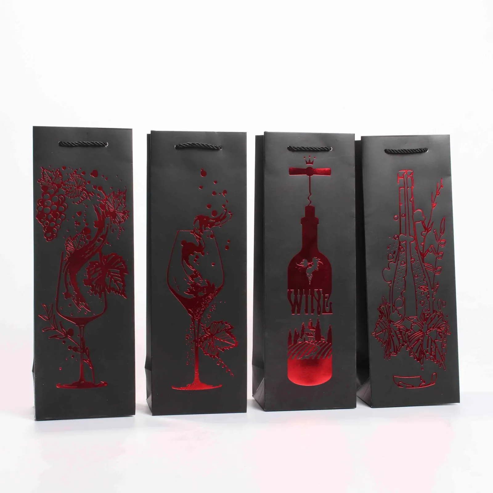
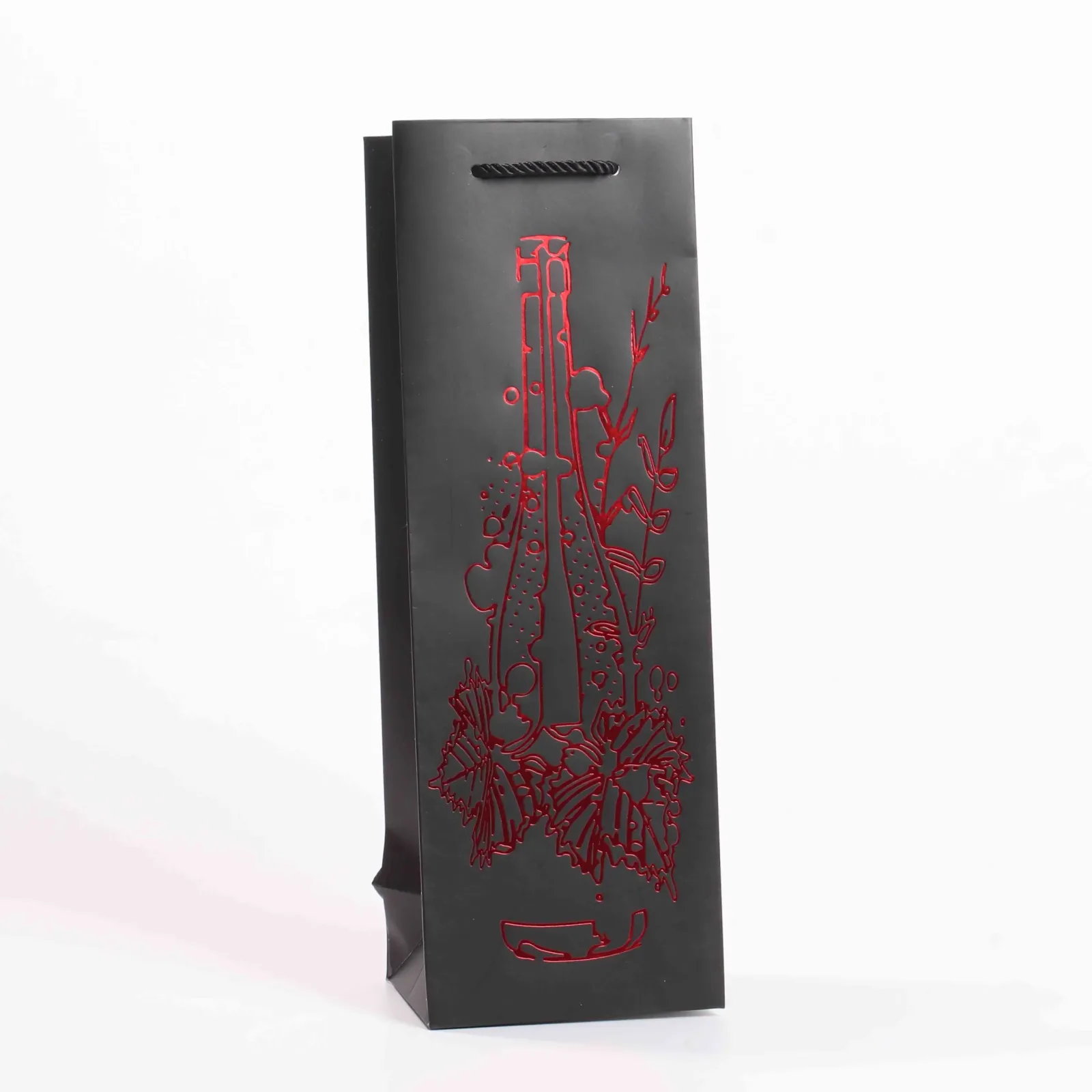
Black cardstock is a different job. CMYK ink is translucent, so printing light artwork straight onto black gives you a muddy result. You need foil stamping or an opaque white underprint. Gold and silver foil are the common choices here. They read as premium under shop lighting. Coated specialty papers, including gold and silver cardboard, can take fine detail well. But they show fingerprints and scuffs faster than uncoated stock.
Kraft is the one buyers underestimate. It's warm and textured, which is great for a rustic look. But every colour shifts warm on it. A cool grey becomes beige. A blue goes greenish. If brand colour matters, ask for a coated kraft or accept the shift. Flocked and leather-textured papers are tactile. They're not for fine print, though. The texture breaks up small type and thin rules.
- White cardstock: best for four-colour and photographic artwork.
- Black cardstock: use foil or opaque white, not CMYK alone.
- Kraft: expect a warm colour shift on every ink.
- Coated specialty papers: fine detail works, scuffing shows faster.
Four-colour, spot colour and what they cost
Four-colour offset is the workhorse for a paper wine bag with photos or complex gradients. Setup means four plates. The first bag costs more in tooling than a one-colour job, but the unit price drops as quantity rises. If your artwork is a logo and one or two brand colours, spot colour is often cheaper and more consistent. A Pantone match is a single plate. It holds the same from the first bag to the last.
Spot colour also solves a problem four-colour cannot: large solid areas. A big block of brand red printed in CMYK can look streaky. It shifts if the press operator adjusts density. A spot red is one ink, one density, one result. When a buyer brings me a design with a huge solid background, I ask if they can accept a Pantone instead of a process build.
Cost is not just the plate. Four-colour needs more makeready sheets to balance the four inks. It's less forgiving on absorbent stock. Spot colour on kraft or uncoated card is straightforward and predictable. If the budget is tight and the design is simple, one or two spots will usually beat four-colour.
- Four-colour: best for photos, higher setup, lower unit cost at volume.
- Spot colour: one plate per colour, consistent solids, often cheaper for simple designs.
- Large solid areas: spot colour avoids streaking and density shifts.
- On absorbent stock: spot colour is more predictable than four-colour.
Foil stamping: gold, silver and the hard cases
Gold foil on a wine bag is not just decoration. It's the answer when the stock is too dark for ink. A Christmas wine bag in deep red or black with gold foil looks rich. The foil sits on the surface instead of sinking in. Silver foil works the same way on cool colours. But it can look cheap on warm stock, so I show a sample before committing.
Foil stamping needs a metal die. That's a one-time setup cost. The die is made to your artwork. It can stamp fine lines and small text, but very thin lines may not transfer cleanly on textured paper. Foil also shows every imperfection in the sheet. A smooth coated stock gives the sharpest result. On uncoated kraft, foil looks softer and more rustic. Some buyers want that.
The failure mode I see most is foil over a fold. The bag gets creased. The foil cracks along the crease. The bag looks damaged before it leaves the shop. Keep foil away from the side gussets and the bottom fold. If your design puts a foil logo across a fold line, move it or accept the crack. A custom wine bag should be designed around the structure, not against it.
- Foil is the right choice for dark stocks where ink fails.
- A metal die is a one-time cost; fine lines need a smooth sheet.
- Foil cracks on fold lines, so keep it off gussets and the bottom.
- Gold foil reads premium; silver can look cheap on warm stock.
Spot UV and lamination: shine and protection
Spot UV is a clear coating applied only where you want gloss. It makes a logo or a pattern stand out against a matt background. It works on white, black and coated stocks. The effect is subtle under flat light but obvious under shop spotlights. Buyers use it to add a tactile difference. Run a finger over a spot UV logo and you feel the raised edge.
Matt and gloss lamination are full-sheet coatings. Matt lamination softens the look and hides fingerprints. That's why it's common on dark bags. Gloss lamination makes colours pop but shows every scuff. On a bag that gets handled a lot, a large dark solid with gloss lamination will look worn after a few uses. Matt is the safer choice for retail.
One warning: spot UV and lamination change the sheet stiffness. A heavy coating makes the paper less willing to fold cleanly. The crease lines can crack if the design puts a coating across them. Our rule is to keep coatings off the fold lines, same as foil. The bag has to fold. A cracked crease is a reject.
- Spot UV adds gloss and texture to selected areas only.
- Matt lamination hides fingerprints; gloss shows scuffs.
- Coatings on fold lines cause cracking, so keep them clear.
- A coated sheet is stiffer, so crease placement matters more.
Handles, patches and where the print breaks
The handle patch is the most common place a printed wine bag fails. A paper handle glued or riveted to the inside face lands on the artwork. If the patch is printed, the glue can lift the ink. We put the patch on the inside and keep the outside print clear of the glue area. If your design has a logo right where the handle sits, move the logo or use a different handle style.
Fold lines are the second problem. A bag has side gussets and a bottom fold. Fine detail across those lines will crack when the bag is folded flat for shipping and then erected. Small text, thin rules and halftone images are the worst. Keep critical artwork at least a few millimetres from any fold. If the design must cross a fold, use a solid colour or a coarse pattern that will not show the crack.
Reinforcement interacts with print too. A card patch at the handle adds strength. But it changes the surface height, so foil or UV over the patch edge can look uneven. We check the patch position against the artwork at the proof stage. A quality check that misses this sends a bag to the customer with a visible step in the finish.
- Keep print clear of the handle glue area to avoid ink lifting.
- Fine detail across fold lines cracks; use solids or coarse patterns there.
- Handle patches change surface height, so finishes look uneven at the edge.
- Check patch position against artwork at proof stage.
Colour control: what we match and what we watch
We match Pantone references and approve a first article before the run. Mid-run sampling keeps the density steady. A press operator can drift over a long run without noticing. The colours that cause the most trouble are black, deep blue and burgundy. They're dense. A small change in ink film thickness shows as a big shift. They look different under shop lighting than under press lighting.
Black is the hardest. A rich black built from CMYK can shift green or purple if one plate drifts. A pure black spot is more stable. But it can look flat on coated stock. Deep blue and burgundy have the same issue. They're near the edge of the gamut, so a tiny change in dot gain moves them visibly. We sample these colours more often during the run.
The practical rule is to approve a physical proof under the lighting where the bag will be sold. A colour that matches in the factory may not match on a shelf. If the buyer cannot approve in person, we send a printed sample and ask them to check it in their shop. No two lighting conditions are the same. The bag has to look right where the customer sees it.
- Pantone matching with first-article approval before the run.
- Mid-run sampling catches density drift on long runs.
- Black, deep blue and burgundy are the hardest to hold.
- Approve a proof under the lighting where the bag will be sold.
Artwork checklist before you send the file
Send the file as a vector PDF with fonts outlined and Pantone references named. Check the bleed: the artwork must extend past the cut line, or the bag will show a white edge. Check the fold lines: no fine detail, no foil, no UV across them. Check the handle area: no critical artwork under the patch or glue.
Check the stock. If the bag is black cardstock, your light artwork needs foil or opaque white, not CMYK. If it's kraft, expect the warm shift. If it's coated specialty paper, fine detail works but scuffs show. A material choice is a print decision, not just a look.
Check the colour expectations. Black, deep blue and burgundy will shift under different lighting. Approve a physical proof. Check the quantity and the structure. A bag that holds two 750 ml bottles needs a stronger handle and a wider gusset than a single-bottle bag. The print has to survive the bag's job, not just look good on a screen.
- Vector PDF, fonts outlined, Pantone references named.
- Bleed extends past cut lines; no white edges.
- No fine detail, foil or UV across fold lines.
- Handle area clear of critical artwork and glue.
- Approve a physical proof under shop lighting.
Key points
- Pick the stock first: white for four-colour, black for foil, kraft for warm shifts.
- Spot colour beats four-colour for large solids and simple logos.
- Keep foil, UV and fine detail off fold lines and handle glue areas.
- Approve a physical proof under the lighting where the bag will be sold.
- Black, deep blue and burgundy need extra sampling during the run.
Questions buyers ask
Can I print white text on a black paper wine bag?
Yes, but not with standard CMYK. Use foil stamping in white or silver, or print an opaque white underlay first. Standard inks are translucent, so white printed directly on black looks grey or disappears. Foil gives a crisp, bright result and is the usual choice for dark stocks.
Why does my kraft wine bag look more orange than the proof?
Kraft paper is warm and absorbent, so every ink shifts toward yellow or brown. A cool grey becomes beige, a blue goes greenish. The only fix is to use a coated kraft or accept the shift. We can print a sample on the actual stock so you see the real colour before the run.
How do I stop gold foil from cracking on the fold lines?
Keep the foil off the fold lines. A crease breaks the foil layer, and the crack shows as a bright line. Move the logo or pattern away from the side gussets and bottom fold. If the design must cross a fold, use a solid ink or a coarse pattern that will not show the crack.
Send your artwork and stock choice, and we will tell you which print process fits the bag and the budget. Get a Quote
Put this on your bottle
Send the bottle sample or dimensions, quantity and a reference design. We reply with structure options and pricing.
- Email[email protected]